We will work here on a dataset that is fairly well known in spatial analysis – the “meuse” dataset – in order to reintroduce a number of concepts to those who would like to engage in linear modelling of spatialized data. This case study will be treated under the R language.
One of the big interest of the meuse dataset is that it is directly available in the sp package of R. It is thus sufficient to load the package to be able to retrieve the associated data. The meuse dataset contains the concentration of heavy metals (zinc, copper, lead, and cadmium) in the upper soil layer of a floodplain along the Meuse River. One hypothesis is that sediments polluted by these heavy metals are transported by the river and are mainly deposited near the shore and in low-lying areas. That’s what we’re going to try to model in this case study, looking at zinc in particular.
[sourcecode language=”r”]
library(sf)
library(sp)
data(meuse)## loading data
meuse = st_as_sf(meuse,coords=c(“x”,”y”),remove=FALSE) ## transforming data frame into sf object
summary(meuse)
[/sourcecode]

Figure 1. Descriptive statistics of the meuse dataset. The attributes available in addition to the four heavy metals are: “elevation” (elevation of the land), “dist” (the distance to the Meuse River normalized between 0 and 1), “om” (the organic matter content of the soil), “ffreq” (the frequency of flooding), “soil” (the type of soil), “lime” (the class of lime or presence of limestone), “landuse” (the land use), “dist.m” (the distance to the Meuse River in metres). I invite you to type the following command line ‘help(data(“meuse”))’ for more information on each of these variables.
The ‘meuse’ data set contains a set of 155 sampling points for which quantitative variables (heavy metal concentrations, elevation and distance to the Meuse River, soil organic matter content) and qualitative variables (the remaining variables) are available.
Small reminders of linear modelling :
The objective of this small case study is to explain the distribution of zinc concentration within the site. We will specifically confine ourselves to linear modelling (this is the idea of this post) in order not to scatter. Depending on the type of variables used to explain the behaviour of the “zinc” variable, several choices are available to us :
- Simple linear model: A single quantitative variable is used as input to the model.
- Multiple linear model: Several quantitative variables are used as input to the model
- One-way ANOVA: A single qualitative variable is used as input to the model
- Two-ways ANOVA: Two qualitative variables are used as input to the model
- Multiple-ways ANOVA: More than two qualitative variables are used as input to the model
- ANCOVA: At least one quantitative AND one qualitative variable are used as input to the model.
The use of linear data modelling is not trivial. Strong assumptions need to be verified to ensure that the coefficients of linear modelling are robust and thus that the model can be used for explanatory and/or predictive purposes. These assumptions are as follows:
- A linear relationship must exist between the explanatory variable and the variable to be predicted. This assumption may seem obvious but it is very important to consider
- The model residues should follow a normal distribution
- The residuals in the model must be homoscedastic, i.e. the variance of the residuals must be stable with the values of the observations and for each of the input variables used.
- The model residues must be independent of each other.
We will come back to this in the rest of this case study.
Now let’s see what the spatial dataset looks like when presented on a map.
[sourcecode language=”r”]
data(meuse.grid) ## loading gridded data
coordinates(meuse.grid) = c(“x”, “y”)
meuse.grid = as(meuse.grid, “SpatialPixels”) ## transform gridded data into Spatial Pixels
data(meuse.riv) ### loading river data
meuse.lst = list(Polygons(list(Polygon(meuse.riv)),”meuse.riv”))
meuse.sr = SpatialPolygons(meuse.lst) ## concatenate all polygons of the river to reconstruct it entirely
image(meuse.grid, col = “lightgrey”)
plot(meuse.sr, col = “grey”, add = TRUE) ## plot the river data
plot(meuse[,c(‘zinc’)], add = TRUE, cex=1.5)## plot the zinc dataset
title(“Meuse dataset”) ## set the title of the plot
[/sourcecode]
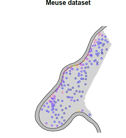
Figure 2. Zinc concentration on the floodplain along the Meuse River.
So we see the meandering Meuse River, and – as expressed in the introduction – it would appear that zinc concentrations are higher along the river.
One of the first things to do in any exploratory study is to visualize the data so that we can assess how to look at the problem.
[sourcecode language=”r”]
library(GGally)
st_geometry(meuse) = NULL ## Transforming back the sf object into a data frame
ggpairs(meuse[,3:9]) ## print correlations between quantitative variables
[/sourcecode]
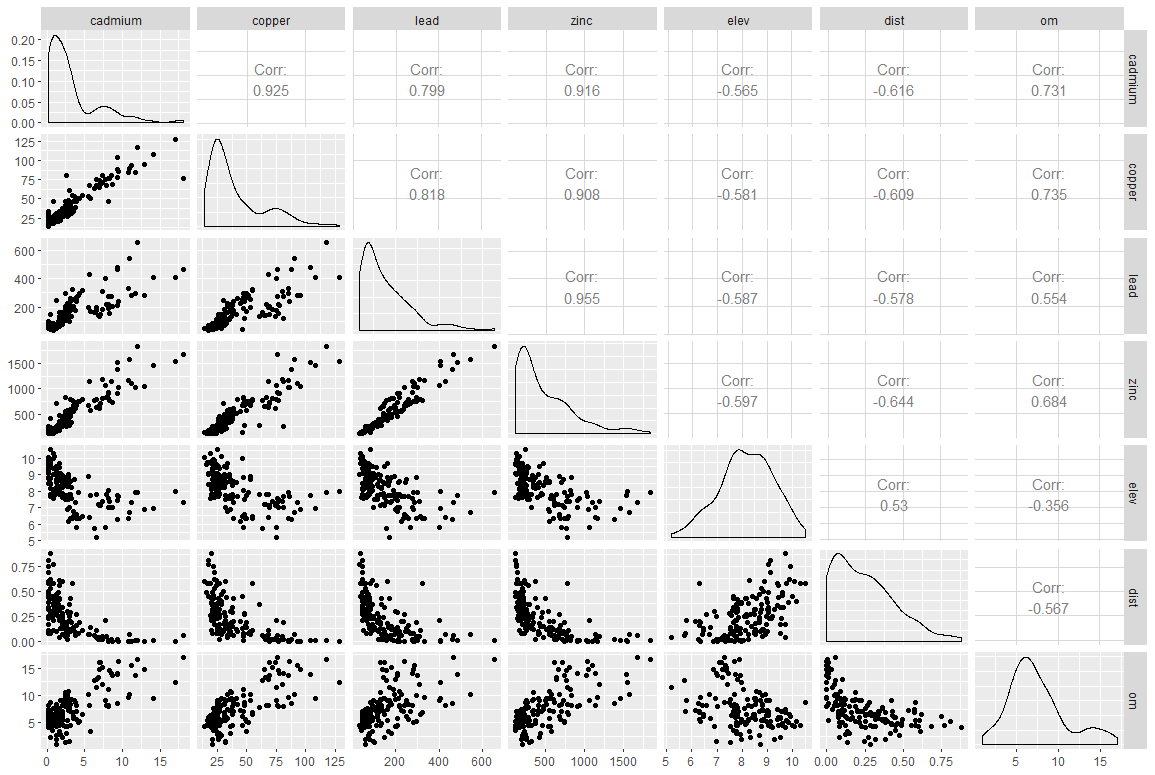
Figure 3. Correlations between quantitative variables in the meuse dataset
Figure 3 already shows us that the concentrations of the four heavy metals at the site are very strongly correlated with each other (Pearson correlation values above 0.8), which is not necessarily surprising). The correlation between variables can be read diagonally in the figure. For example, the correlation between cadmium and copper concentrations is 0.925. The correlation between cadmium and zinc concentrations is 0.916. As a reminder, we focus here on the zinc concentration. Here we face a problem of multi-collinearity, i.e. several of the variables that could be used to explain the distribution of zinc concentrations are correlated with each other. Considering these variables together would lead to highly biased coefficients in the model. In any case, we would not have tried to explain the zinc concentration with other heavy metal concentrations (it would not make much sense) but this problem of multi-collinearity must be considered very seriously. If we always look at zinc, we realize that the relationships with the rest of the quantitative variables (elev, dist, and om) are not that linear (I remind you that one of the strong hypotheses of linear modeling is to have a linear relationship between the explanatory variables and the variable to explain). Let’s take a closer look.
[sourcecode language=”r”]
library(cowplot)
plot_grid(
ggplot(meuse, aes(y = zinc, x = elev)) + geom_point(),
ggplot(meuse, aes(y = log(zinc), x = elev)) + geom_point(),
nrow = 1, ncol = 2)
plot_grid(
ggplot(meuse, aes(y = zinc, x = dist)) + geom_point(),
ggplot(meuse, aes(y = log(zinc), x = dist)) + geom_point(),
ggplot(meuse, aes(y = log(zinc), x = sqrt(dist))) + geom_point(),
nrow = 1, ncol = 3)
[/sourcecode]
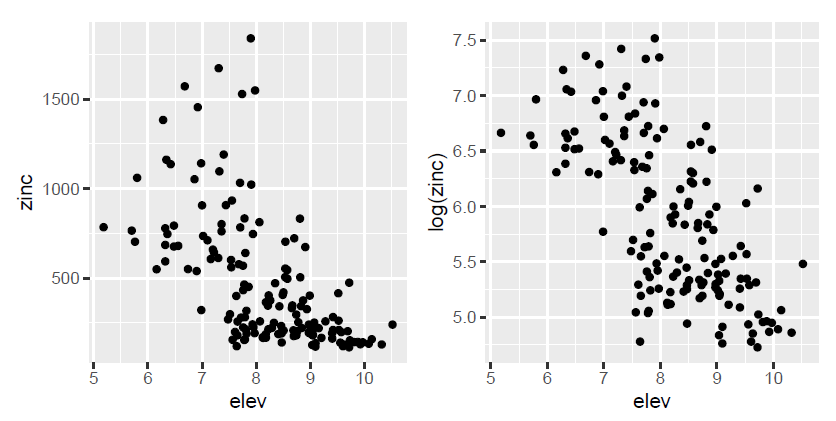
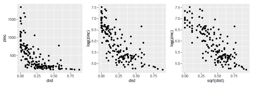
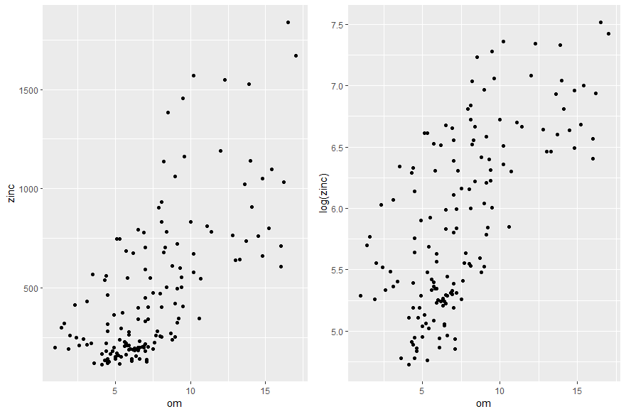
Figure 4. Study of the relationship between zinc concentration on the one hand, and the altitude of the land and the distance to the Meuse River and the organic matter content of the soil on the other hand.
By zooming in on the graphs, we can see that the hypothesis of a linear relationship between the zinc concentration on the one hand, and the altitude of the land and the distance to the Meuse river on the other hand, is hardly justifiable. To solve this problem, one of the solutions consists in transforming the variables (logarithmic transformation, square transformations etc…) to make linear relationships appear and assume the main hypothesis of the modelling. After transforming the variables, we realize that instead of trying to explain the zinc concentration, it would be better to explain the log zinc concentration, because it seems to be linearly related to the elevation over the study site, and to the square of the distance to the Meuse River. For the soil organic matter content variable, the linear relationship with the log zinc concentration is somewhat coarse but could be considered.
Let us now look at the relationships between zinc concentration and the qualitative variables available in the dataset
[sourcecode language=”r”]
plot_grid(
ggplot(meuse, aes(y = log(zinc), x = ffreq)) + geom_boxplot(),
ggplot(meuse, aes(y = log(zinc), x = soil)) + geom_boxplot(),
ggplot(meuse, aes(y = log(zinc), x = lime)) + geom_boxplot(),
ggplot(meuse, aes(y = log(zinc), x = landuse)) + geom_boxplot(),
nrow = 2, ncol = 2)
[/sourcecode]
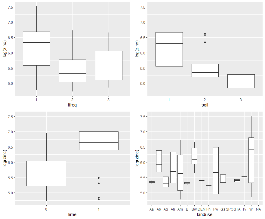
Figure 5. Study of the relationships between zinc concentration on the one hand, and the qualitative variables flood frequency, soil type, lime class and land use on the other.
A good discrimination of the log zinc concentration on three qualitative variables – flood frequency, soil type and lime class – is observed here. There also appears to be some disparity by land use, but on closer examination, one of the big concerns with this land use variable is the amount of modalities present. For some modalities, there are extremely few sampling points! A glance with the “table” function makes it easy to realize this…

We then find ourselves faced with the problem of unbalanced group sizes and small groups. One way to solve this problem could be to reduce the total number of groups per classification, for example by trying to group all land uses into the three majority groups present (Ah, Am, and W). For the sake of simplicity here, we will simply no longer consider this land use variable to explain the zinc concentration at our study site.
Linear modeling
Based on this preliminary study, three quantitative variables (elevation over thesite, squared distance to the river, organic matter content) and three qualitative variables (frequency of flooding, soil type, and presence or absence of limestone) remain to try to explain the zinc concentration on the study plain. After some additional studies, it also appears :
- that there is no limestone in soil classes 2 and 3. Of these two pedological qualitative variables, we will only retain the one concerning the type of soil
- Soil type is closely related to the distance to the river; we will only consider the squared distance to the river and not soil type.
- Flood frequency is not totally related to the distance to the river (strangely enough at first glance), so this variable is maintained in the modelling as well.
In view of the quantitative and qualitative variables that can be used, a model in the form of an ANCOVA is therefore put in place. No interaction between variables is considered in this case study.
[sourcecode language=”r”]
library(tidyr)
meuse=meuse %>% drop_na() ## Remove NA variables
Model1=lm(log(zinc)~elev+sqrt(dist)+om+ffreq,data=meuse)
anova(Model1)
[/sourcecode]

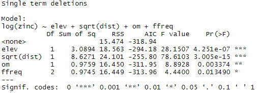
It can be seen here that all the variables included in the model have a significant impact on the log zinc concentration. The results of the drop1 function show that the suppression of one of the variables is not necessary. Simplifying the model could be relevant for logistical reasons or for the understanding of the model; but in our case we will consider these variables as useful.
[sourcecode language=”r”]
drop1(Model1, . ~ ., test=”F”)
[/sourcecode]
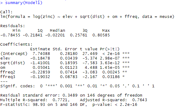
The model coefficients are then extracted with the summary function:
We now need to be sure of the four assumptions of the linear model that we made at the beginning. These hypotheses can be studied through the following diagnostic graphs:
[sourcecode language=”r”]
par(mfrow = c(2, 2))
plot(Model1)
[/sourcecode]
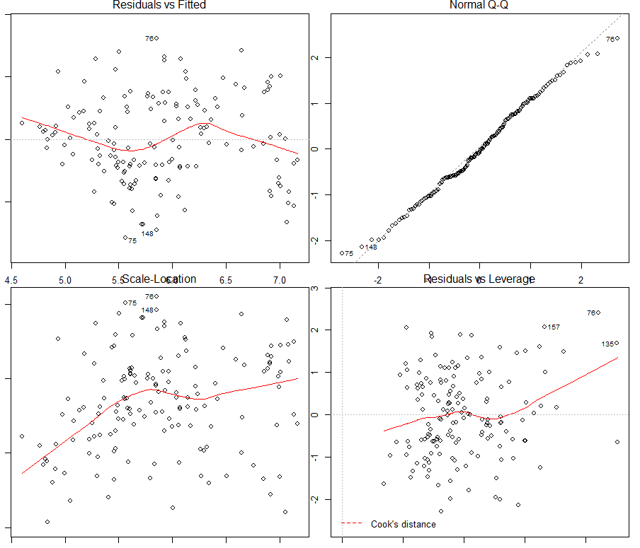
Figure 6. Verification of assumptions made on the linear model
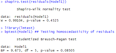
The first quadrant of Figure 6 shows that the assumption of linearity between the log zinc concentration and the explanatory variables used can be assumed (there are no specific patterns). Similarly, the hypothesis of normality of the residuals seems viable in the second quadrant (a shapiro test will confirm this immediately afterwards – the hypothesis of normality cannot be rejected). In the third quadrant, the hypothesis of homoscedasticity of the residuals seems to be at the limit of validity, with an increasing trend with the values of the data (a Breusch Pagan test will just confirm the homoscedasticity of the residuals – the H0 hypothesis of homoscedasticity cannot be rejected).
The following code presents the results of the shapiro and Breusch Pagan residue tests.
[sourcecode language=”r”]
shapiro.test(residuals(Model1)) ## Testing normality of residuals
library(lmtest)
bptest(Model1) ## Testing homoscedasticity of residuals
[/sourcecode]
The last quadrant shows some outliers in the dataset, including observations #76, 157, and 135. Observations n°75 and 148 can be added to this quadrant in the view of the other quadrants. By displaying these influential data on a map, it does not appear that these data are located at a specific place on the study site. However, a more detailed study could be conducted to understand why these observations are influential.
[sourcecode language=”r”]
Outliers=which(row.names(meuse)%in%c(“75″,”76″,”135″,”148″,”157”))
data(meuse) ## loading data
meuse = st_as_sf(meuse,coords=c(“x”,”y”),remove=FALSE) ## transforming data frame into sf object
data(meuse.grid) ## loading gridded data
coordinates(meuse.grid) = c(“x”, “y”)
meuse.grid = as(meuse.grid, “SpatialPixels”) ## transform gridded data into Spatial Pixels
data(meuse.riv) ### loading river data
meuse.lst = list(Polygons(list(Polygon(meuse.riv)),”meuse.riv”))
meuse.sr = SpatialPolygons(meuse.lst) ## concatenate all polygons of the river to reconstruct it entirely
image(meuse.grid, col = “lightgrey”)
plot(meuse.sr, col = “grey”, add = TRUE) ## plot the river data
plot(meuse[Outliers,c(‘zinc’)], add = TRUE, cex=1.5,col=”black”) ## plot the zinc dataset
title(“Meuse dataset”)
[/sourcecode]
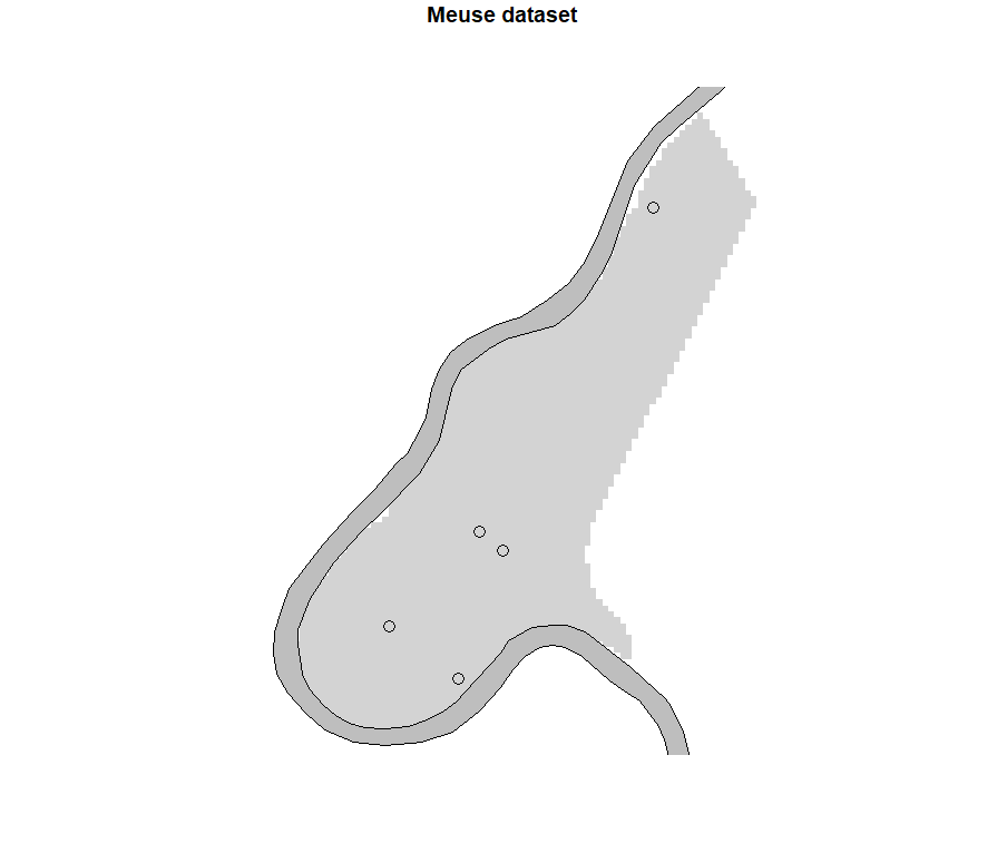
Figure 7. Display of outlying data on the map
The final hypothesis to be verified remains the independence of the residuals. This hypothesis can be evaluated by constructing a variogram on these residues.
[sourcecode language=”r”]
library(tidyr)
meuse=meuse %>% drop_na() ## Remove NA variables
Model1=lm(log(zinc)~elev+sqrt(dist)+om+ffreq,data=meuse)
meuse$residuals=residuals(Model1)
library(gstat)
Vario_res=variogram(residuals~x+y,data=meuse,cutoff=1200,alpha=c(0,45,90,135))## plotting directional variograms
Vario_res.fit = vgm(.13, “Sph”, 1000, .02, anis = c(45, .6)) ## Fitting a model
plot(Vario_res,Vario_res.fit)
[/sourcecode]
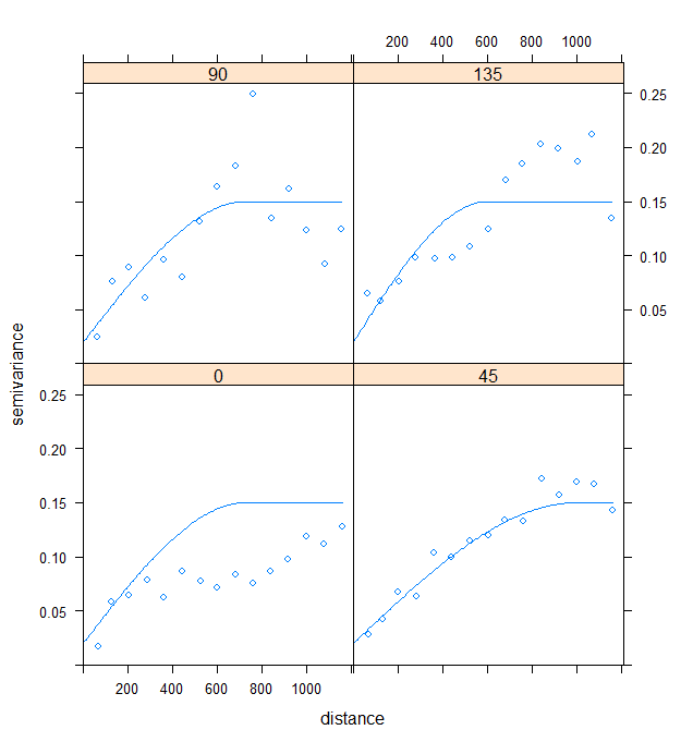
Figure 8. Directional Variograms of Model 1 Residuals
Here, the choice of an anisotropic modelling of the spatial structure was made in view of the shape of the study site. As the plain is oriented in a South-West/North-East direction, it is not surprising that the direction of strongest spatial structure is that at 45° (i.e. North-East). A spherical model was considered here as it seemed the most appropriate. These variograms mainly show us that the residuals are not independent and that a spatial structure is still present in the residuals… We cannot therefore have blind confidence (the term is perhaps a bit strong…) in the coefficients of our model.
There are several ways to consider this spatial structure in our modeling. We can either work :
- in the form of a regression model like the Spatial Lag model, the Spatial Error model, or a combination of both. In this case, it is necessary to define neighborhood relationships between the points, and then compare the most appropriate regression models with the data.
- in the form of an extended linear model and add a correlation structure to the model.
It is this second option that we will choose here. Adding a spatial correlation structure requires changing the R function. Instead of using the classical function ‘lm’, we have to use the package ‘nlme’ and the function ‘gls’. Note also that the gls function is interesting in the sense that it is possible to add other interesting arguments, in particular to model the heteroskedasticity of the residuals if the latter is present.
[sourcecode language=”r”]
library(nlme)
modSpher = gls(log(zinc)~elev+sqrt(dist)+om+ffreq,data=meuse,correlation=corSpher(c(1000, 0.15),form=~x+y,nugget=T)) ## Adding a correlation structure with a spherical form in the modelling
VarioSpher_raw = Variogram(modSpher, form =~ x+y,robust = TRUE, maxDist = 1000, resType = “pearson”) ## variogram of the raw residuals
VarioSpher_normalized = Variogram(modSpher, form =~ x+y,robust = TRUE, maxDist = 1000, resType = “normalized”) ## variogram of the studentized residuals
plot(VarioSpher_raw)
plot(VarioSpher_normalized)
[/sourcecode]
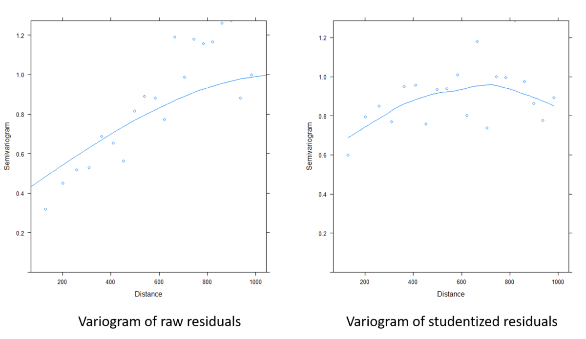
Figure 9. Comparison of variograms on model residuals before and after taking into account the spatial structure
Figure 9 shows how much of the remaining spatial structure in the tailings has been removed. The model coefficients can therefore be extracted and help to better understand the behaviour of the log zinc concentration at the study site. You can also see that these coefficients are slightly different from those obtained without taking into account the spatial structure.
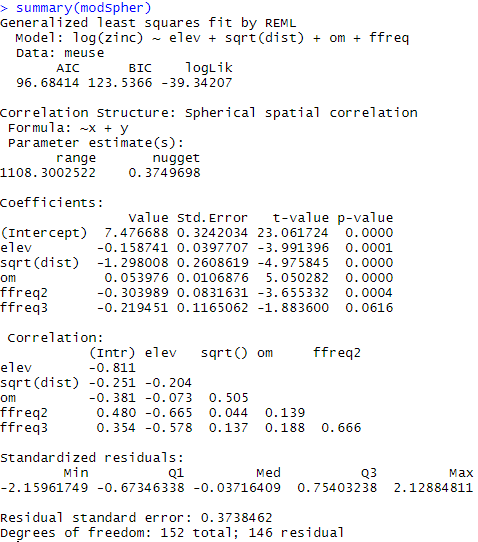
Once this work has been completed, it is still possible to interpolate the log zinc concentration at the study site. We won’t go that far, but several options are available to us:
- Relatively simple ordinary kriging.
- Universal kriging using x/y coordinates at the study site (surface trend of order 1, or even 2)
- Regression Kriging if there is a continuous variable over the entire study site. This is for example the case with the distance to the river (it is a parameter that can be calculated simply at each node of a grid of interpolation). One can also imagine being able to create a fairly precise elevation map by interpolation (if the elevation variations are not too large). A simpler regression model than Model 1 used in this case study could therefore be used to improve the interpolation of the log zinc concentration.
Support Aspexit’s blog posts on TIPEEE
A small donation to continue to offer quality content and to always share and popularize knowledge =) ?

